Microsoft is on the way to a major redesign for Outlook on Windows and Mac. In recent times, Microsoft redesigned the Outlook on iOS as well and now the plan is to bring similar looking design to Mac and Windows too.
It is certainly a good move to redesign as the existing design of Outlook is quite messy and difficult to use. User demands simpler and easier design to use for everyone.
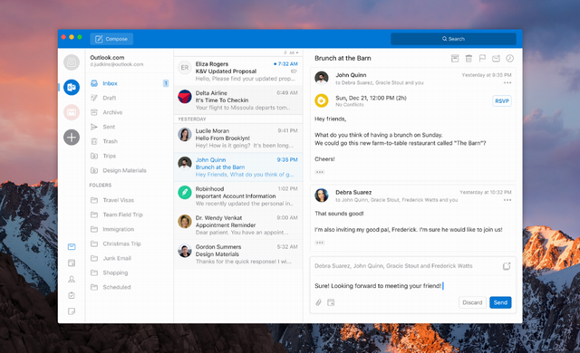
The new design was presented at the Ignite 2017, which was held back in March. On the whole, the design of the app looks a way cleaner and attractive than the Outlook 2017. There’s a new ribbon design which is totally customizable.
There would be left navigation bar to give you a quick access to all the folders like Inbox, Outbox, and drafts. You can have separate access to all of your accounts as you can add multiple accounts in the app and all of your accounts will be available on the left navigation panel individually.
The new look would be more handy and user-friendly.
According to Microsoft perspective “MacBooks are popular amongst key influencers and decision makers,” and that the company “needs to win these users by delivering the best Outlook has to offer.”
As the user has problems about search and calendar, now Search is placed on the top right corner of the app which means this time it would be easier and faster to access.
The new Outlook will surely include improvements to search and calendar. To get better manage your events calendar redesign of the calendar is necessary.
It is not clear yet that when we will get our hands on the new look. It is predictable that the new design will be the part of Microsoft Office 2019 which is set to launch next year.


