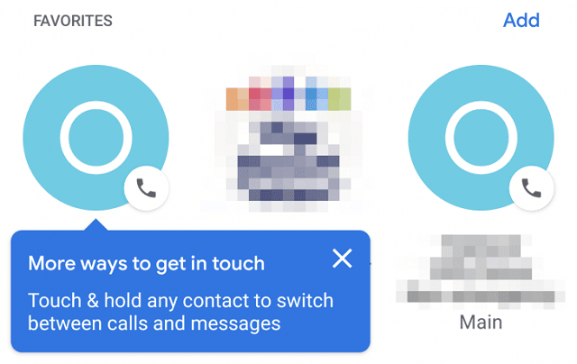
So back in August, we got to know of the redesigned Favorites tab for the Google phone application which was to their surprise welcomed by many readers of the report. Now it has taken Google four months for their new User interface to reach the user’s phones. But in all honesty it does seem like a really amazing rollout of the application.
Moreover the most notable change in the application is obviously the circular icons for the contacts marked as Favorites. Now the previous version of the Interface had been around for the users for some time now and well in all honesty started to look a wee bit dead, so this design is welcomed by many potential consumers. Moreover a blue popup will also appear for those seeing the interface for the very first time and in turn that will help explain how a long-press can allow users to switch between their on-going calls and messages.
Must Read: Careem CEO is the only Pakistani to make in the Bloomberg 50 list for 2018
Moreover Google has also featured a Dark mode in their new design of the application. Furthermore scrolling past the favorites will help in revealing a list of the recently-contacted and the frequently contacted numbers that Google thinks you may find useful. Interestingly, as we know that this part of the application is labelled as the ‘frequents’ , in the Pixel 3XL it is labelled as the Suggested. All in all the new design looks to be very attractive and is one which any user would enjoy.
Finally the new rollout seems to be server-based, with its redesign also visible to the Artem, and several tipsters even without having to updating the phone to Phone v27. Moreover share with us if you also have the option of getting yourself the new UI on you’re phone.


