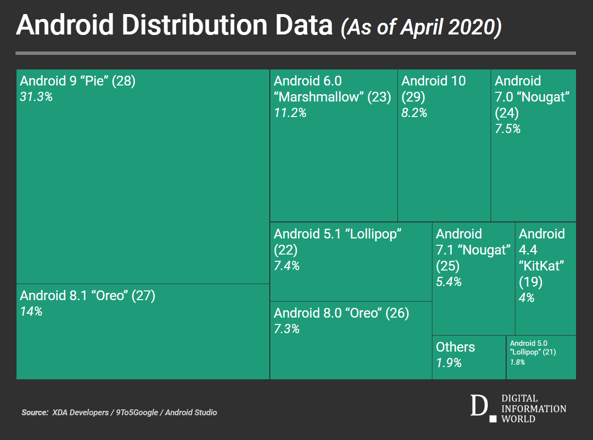
Every month we used to see an update to the ever so present Android distribution chart – and this update was always courtesy of Google. The Android distribution chart is basically a chart which lets us know exactly what percentage of users are running each Android version. Unfortunately enough though, this particular chart has not seen an update in nearly a year. The latest update is that Google has taken the chart completely off the internet – and there has been no explanation as to what motivated the company to do so.
But the search engine giant did put up a notice in the distribution chart’s usual location so as to tell us to find platform version information in Android studio. While there isn’t any way to ascertain any opinion as to why Google followed such a route – it does kind of make sense. Such numbers are in fact mostly only useful for developers, and so making the Android Studio the specified location to see version distribution isn’t the most crazy decision in the world.
In any case, the distribution numbers that the chart showed were also never in the place that you’d imagine Google wanting them to be in. Older Android versions such as Marshmallow still make up more than 15 percent of the company’s market share. In fact, Apple even took aid of the chart in order to argue that iOS devices were more up to date than their Android competitors – even though this isn’t a really fair comparison. Many Android devices fill various niches that iOS handsets do not or simply cannot – and so, it does make sense that not every Android smartphone needs the latest or the greatest software.
Taking a more in-depth view of the numbers, Google provides developers show cumulative distribution percentages. This allows devs to know exactly what percentage of global Android users they will lose with every new version of Android. Regardless of the way in which information is portrayed, we still await an official statement from Google to allow us to take a better view of the situation at hand.


